A Charming Bathroom
Happy Friday y’all! Ok, so today is not technically a Friday but if you live in New Braunfels, TX, it sure feels that way. It is the last day of the school week for our little ones to celebrate the Comal County Fair! Yeehaw!! My family and I are taking advantage of the three day weekend and going camping with the in-laws. Which brings me to the topic of my blog post. Their bathroom!!
My in-laws have a beautiful victorian folk house that they have pretty much always been renovating. They joke that by the time they get to the end of their to do list, they might as well just start it over again. Yes, it is true, it is a lot of work to own an older home but the character and the charm are unparalleled.
In the late 80’s the attic of this charming home was converted to two bedrooms and a bathroom. Due to low ceiling heights and limited space, the bathroom was and still is very small. It has worked really well for them over the years but recently they have decided to simply update it. The goal of their bathroom renovation was to create a clean lined, modern look with accents of traditional elements.
Take a look at the before pictures!
The dark wainscoting mades this space look smaller and darker. The old vinyl is a definite blast from the past.
The space was dated and dark.
The shower was old and closed off making the space look much smaller.
As you can see in the pictures, space is limited. We really wanted to try and open up the space as much as possible without moving any walls. To accomplish this goal, I recommended a glass shower enclosure in lieu of the pre-fabricated all in one shower. The footprint of the shower actually stayed the same but with the updated glass walls, there is the appearance of more space overall.
The glass shower really brightens and enlarges the space.
I also liked the idea of keeping the vanity wall “light” in appearance, as opposed to the heavy natural wood cabinets that were existing. Some other tricks of the trade are painting the walls a lighter color and either painting the wainscoting the same color as the wall or loosing it all together. When you have a low ceiling height, wainscoting will emphasize the height by making the ceiling appear even lower. The original plan was to keep the beadboard wainscoting but we quickly realized we would not have enough to finish the job and frankly, they just don’t make beadboard like they used to. It would not have been cost effective to match the existing beadboard, as it would have to be custom milled. As a side not when this happens it can be a good idea to save these materials for future projects, especially when you have an older home.
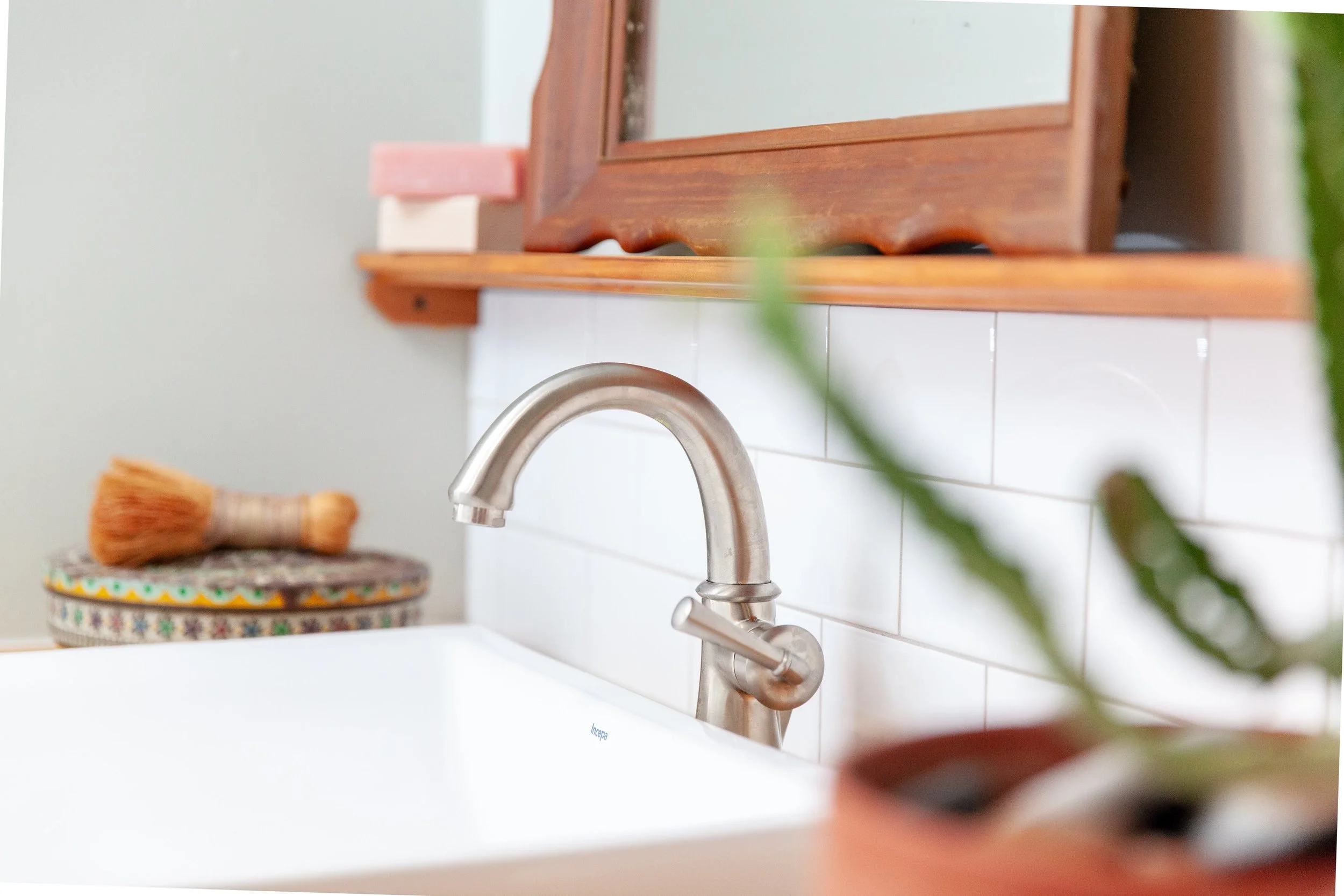
One of the other design obstacles we encountered, is that the maximum depth of the vanity is 15”. The standard vanity depth is 22”, so you can see this is not an ideal situation. To compensate for the shallow depth, I used a apron sink that is much deeper than the vanity. So now you have a full size sink on a very shallow counter.
Beauty and function for limited counter space.
Bringing in the traditional elements to compliment the more modern and clean design.
The ceiling height has a harsh angular edge so I opted for this adorable curvy mirror that softens and warms the space with its wood trim. I also love that I found it one of my favorite antique shops, Max’s Haus in New Braunfels, Texas
Styling for photos.
Let’s talk tile! The existing flooring was vinyl. To update this space we found some beautiful 3” hexagon tile for the bathroom floor mixed with a 2” white hexagon tile for the shower floor. We used white subway tile in the shower and we incorporated the subway tile as a simple accent above the countertop.
Three inch hexagon tile from Travis tile, one of our go-to tile shops in San Antonio, Texas.
Having the shape of the tile be the same may have been less effective in this space. However, I love how the contrast in the color actually makes it stand out.
Subway tile makes a space look clean and modern.
Final touches for our photo shoot.
All-in all, we love the way it turned out! Together with the input of the client, in this case my in-laws, we gave an old outdated bathroom new life. My hope is that this design will live on for many years to come and their guests will enjoy their newly renovated space.
Here’s some more pics of the bathroom that we can’t help but include.
Another view.
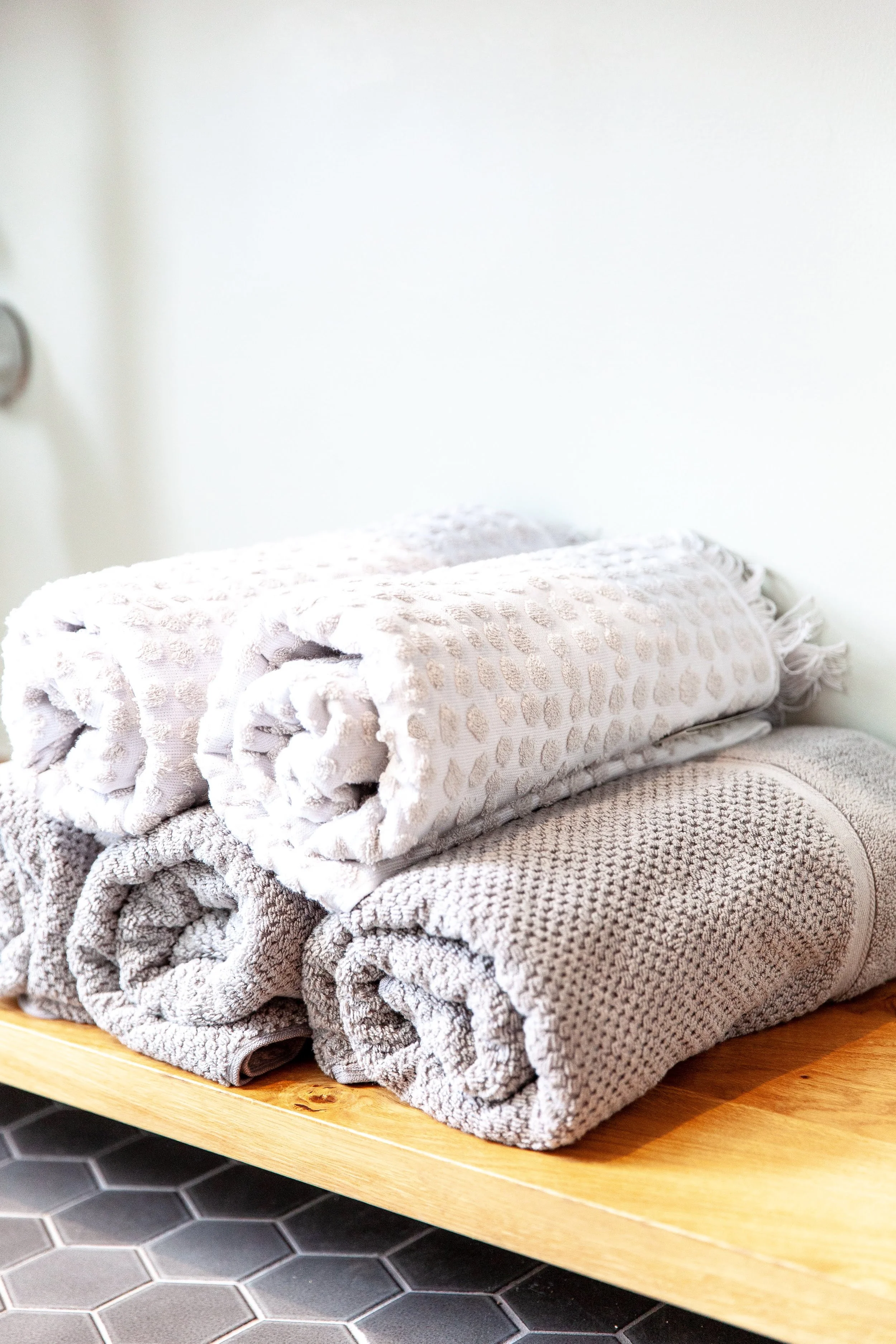
Simple accessories.
Plenty of space below for storage.
One last thing.
We hope you enjoy these photos of a project close to our heart. We’re off to the woods for s’mores and campfires!!
Until next time, if you happen to got to the Comal County Fair don’t forget to put your boots on and have some funnel cake for me.
Stay True!
Allyson


